Friday, April 27, 2012
Final Advert
Radio advert - Recordings
I think the tone of my vooice is alot better in this one, it sounds more natural however i dont like the 'get out' bit it sounds aggressive so i think im going to change the script a bit.
This one isn't the way i wanted the tone isn't good and you can tell its being read from a script. However the change in the script sounds so much better at the end compared to the previous ones.
Script
I am just having one person in this ad.
Have you experienced this month’s Manx experience?
The elegant sophisticated magazine for you.
It’s got lots of exciting stuff including a giveaway from Manx Telecom, news on a mystery store opening and lots more all for just £2.50.
Get out and experience yours now!
I had to change the end bit too
experience yours now
I changed it because the get out didnt sound good
I used a rhetorical question and the begging to get the listeners involved. I wanted to play on the word experience that's why i used it so much, i think it works well. Also i didn't want to include to much information about whats in the magazine so i just give a taster of 2 things. I included the price because everyone likes to know the price if they are interested in buying something.
Radio Advertisement Research
This is a ad for the iPhone 4. They use Stephen Hawkings as the voice to advertise this. I think they choose him because he is meant to be 'the cleverest man on the planet' so therefor he knows his gadgets and if he thinks the iPhone 4 is good it must be. So people would go and buy one if they know Stepehen Hawkings has one. Also i think the information is good because it is saying what is new and what is different from the 3GS.
This ad is for a toy store. I like how it has two parts to it, first is about the toys and the offers then the second part is about the baby furniture etc. Its god how they say of the offers on right now and how much they are such as ' new PlayStation 3 plus 2 games only 319.99 offer includes new fifa 10 and a game of your choice' I think this is a good offer to advertise. However that seems to be focusing at boys more. They should have included an offer fr girls as well. The second part is good because it is advertising a baby sale. Saying to visit now and it says buggy's, car seats and more. That's good for getting people down to the store to find out what is in the sale.
Tuesday, April 24, 2012
Final Billboard
Billboard Drafts
I couldnt find any examples of billboards for magazine. So i just looked at the others and addapted mine.
 This is the rough draft of where i wanted to position things. I am including a little image of the actually magazine front cover
 This is the first one i put together. I choose to use the name of the magazine to sell the magazine. This one is just a play about, the text isn't in the middle and looking at it; it doesn't look like a good billboard. I could maybe consider making the image bigger so people could see what they are buying because the front cover has to catch peoples eyes just like it would in a shop. Also i changed the colour of the word Christmas to green to make it more christmasee, however i don't really think it looks good, since i am going for an elegant look. I tired to create a good background by having the black and white rather than just a plain white background, however i don't think it looks that nice, but ill have a play around with the other bits first then see what the background looks like.
 I have now made the image bigger, i think that looks a lot better. Also doesn't leave as much white space which isn't good. I have also got rid of the green but it still seems like there is something missing. It is very plain and white. Defiantly have to change the background colour.
 I then changed the background colour. I keep going back to green thinking it will work, but it really doesn't. I wouldn't read that if i saw it on a billboard. I also changed some of the text to black. But everything looks really random, it doesn't blend well together.
 I have now went for a more modern look. However it seems to be too dark. I do like the colour of the background but it just overpowers the text. Also i don't like how 'Manx Experience' is positioned. I think i just have a few more adjustments to make. I am going to make the back ground more lighter.


Billboard Research


Friday, April 20, 2012
Final Double Page Spread

Wednesday, April 18, 2012
Double Page Spread Drafts

This is my first idea of what i want my double page spread to look like. It is an interview so columns of text is obvious. This is just a rough lay out plan.

This is my second draft which is followed from my rough plan. I have places the text and the images where i planned too. I'm not sure whether i like this layout. Or maybe its the colour, i decided to go a cream beige colour rather than just the plain white but I'm not sure if it works very well. I have the interview worded and the images ready. I took the images on my camera on my IPhone.

This is the same one as above, however i tried having the background black. I don't think it looks as good as i thought it would. The images get lost and it seems dull and boring. I think i will try and position the text and images different and have a play about with the colour

I then tried to use one large picture on one side of the page then have the text on the other side, however it looks really messy and untidy. I don't think you can have an interview with a photographer and only include one image of 'their work'

I then tried to position the images on the other side of the page. I like the way they are positioned however they don't fit on the page very well. And also i don't think its practical to have the images first, i think its better to read the interview then see the images
Saturday, April 14, 2012
Double Page Spread Research

This double page is from a smaller free regional magazine. This is an interview with a paralympics medallist. I like the lay out of this. It is mostly text with two images. I like how the text is sectioned into small paragraphs so it doesn't seem to much to read so the readers stay interested.


Tuesday, March 27, 2012
Final Front Cover & Conents Page

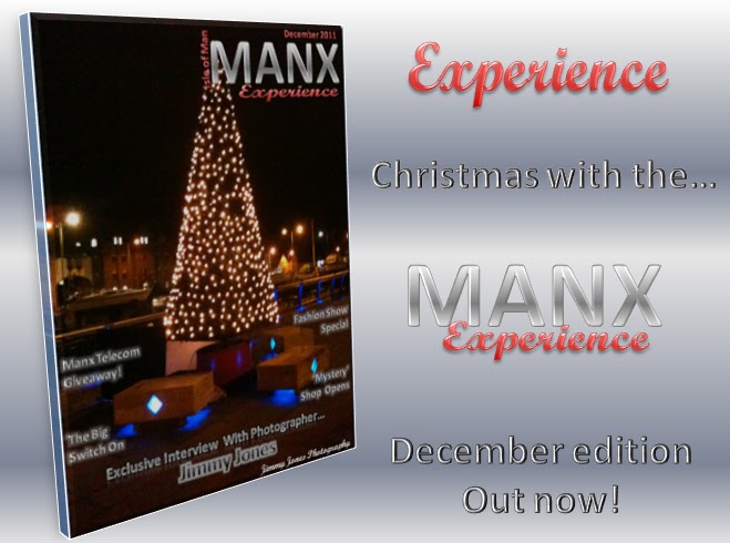
This is my final front cover. I struggled to find a good position for the text so that it wouldn't take the look away from the main image. I then decided to put the text towards the bottom of the page so that the light would still be in the image. Also i wanted the effect that the text was presents around the tree. My main story is about a photographer so that's why the text is in a bigger font than the rest. I think that it looks quite sophisticated and elegant. The masthead fits in and looks good with the rest of the page. I choose to keep the colours basic and i associate black as being a modern colour.

This is my final contents page. I decided to associate the pictures with the text which are the page number you would find the story about that image by colour. I think it brighteners up the page. I didn't want to over do it with the pictures so decided just to use four. I choose to drop the word contents as it is fairly obvious that it is a contents page. Also used the word experience from the masthead, i think it works really well.
Friday, March 16, 2012
Contents Page Drafts
I want my contents page to have the same type of style as my front cover. So i started my ideas with plain black and white and i thought i could include something Christmas associated considering it is around the Christmas time.


This was my first attempt of my contents page. I thought that i wanted to include the title of the magazine and tried it at the top corner, because the 'manx tails' magazine that i researched had that written in the top right corner. However i don't really think that it looks stylish. I choose a white background, because the cover is so dark. I don't want to give the impression of a dark dull magazine. Also i put the date on the top left and choose to put Christmas tree's either side of it. I like the idea of using something like this, but just not sure if this looks the best. I then thought it would be a good idea to section of the page to place the text. However it didn't seem to be even on both sides so i stopped half way through completing this to go on to changing it.

I like the layout of this one a lot better. I decided to get ride of the title of the magazine. I added two 3 legs of man as well. I moved the Christmas trees to either side of the 'Contents'. I'm undecided about them though because i think they look out of place. I then started to position the text and the images. I want to keep all the text towards the left hand side and the images to the right hand side.

I added more text and the rest of the images to get a better idea of how it looks. I'm not sure about having the Christmas tree's there, it makes it less sophisticated then how i want it. Also not sure about the 3 legs of man.
Friday, March 2, 2012
Front Cover Drafts
Here are a few of the drafts i did to get to the final front cover and to the chosen masthead.


This is my first rough draft of the image and the masthead. I needed to play around to see which one looked best. I like the main image, there is a lot of space around the tree itself which is useful for putting text. However i don't think i will put that much on the front because most of the magazines i looked at didn't have very much writing. They just had the main cover story. I tried to create good word art by using the 3 legs of man image in the background of the letters, however it was not successful.

I like this one, i think the text is good, however i think the black font is hidden and doesn't stand out as much as i would have liked. I'm not sure whether to have the text written right across the middle of the image because it is big and bold; which is what i want. However it just doesn't seem right. This also doesn't have the actual masthead on.

Another draft with the other image. I need to decide which one to use. I really like both. However this image seems to have a bit too much going on. There is a lot of colour and the text isn't noticeable. Maybe if i chose a different font. But i really wanted to stick with the Christmas theme and use red. I also have the final masthead on.

This is very similar to the other draft, not much has improved or changed. Apart from the colour of the font and i deleted the 'around the island'. I thought i could use green, which is still a Christmas colour. I also used glow around the word art which sort of gives the affect of lights around the text which i really like. I think i will stick with using the glow around which ever colour or style i use.

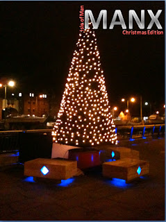
I have now decided to change my cover story a little. I was struggling to to make the other one look good and interesting. Because just having Christmas lights isn't going to make people want to pick up the magazine. So I've chosen to have an 'Interview' with a very famous local photographer. The main image is taken by him which fits in perfectly. His interview will be about him capturing people getting in the Christmas period which will involve some Christmas lights. I want this magazine to be sophisticated and modern so i really like the font. I also included a little symbol type to show that the image was taken by this 'Photographer'. Also i will just have one main cover story. The Manx tails local magazine that i looked at only had one and think it looks really good. Also I've decided this will be a free magazine.

Again i am trying to decided on what image is better. I think that i have found that the other one fits better. The text gets lost behind this image. I do love this though and will include it in my double page. This is good because there isn't much space around the main focus which is the snowman, however text doesn't look right places on it. So the other image will be my main one.
Tuesday, February 28, 2012
Stages of Production - Ideas
I then started to put some ideas together to create the front cover. There was two images that really stood out to me, that i thought would be good to be the main image on the front cover. I also started to consider names for my magazine and create logos etc.
First of all; the logo/names.
 I tried to include the 3 legs of man into the logo of the magazine, but it doesn't seem to work. When i tried it with a background image it just doesn't blend together it looks like a block in the corner. It just doesn't look professional.

 With this one, i really like it. I love how the bulballs fit ontop of the masthead. However i have the same problem with the white box.

This is the best by far, i think this one is really professional. Also it doesn't create a white box when placed with a background.
 I have changed it slightly, i decided that Manx wasnt a good chosen title. I was to plain. So i decided to add 'Experience' to make it more classy. Also decided to drop 'Christmas edition' because having the date which is decdmeber 2011 its kind of obvious.
Then: Front cover ideas;
 This is to show how the masthead/logo looked on the background. It looks really bold and bad. Also the image i chose to use as the main front cover it stretched and doesn't look good.

 I really like this, the quality of the image looks really good. It is really bright and christmasee Also the masthead looks good it doesn't create a white box and it looks really nice this is a strong contender for the final image and masthead.
 This one also looks good but i can see that its just not as eye catching at the other one. There is lights but they just aren't in your face as much as the snow man. Also its not as colourful.
First of all; the logo/names.


I like this one, however it doesn't look very professional. Also when placed on a background it shows as a white box.


Then: Front cover ideas;


This one, again is to show that the masthead doesn't look right when placed on a background. I really like the main cover image. Its defiantly between this and the snowman.


Subscribe to:
Comments (Atom)