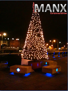
First of all; the logo/names.
I tried to include the 3 legs of man into the logo of the magazine, but it doesn't seem to work. When i tried it with a background image it just doesn't blend together it looks like a block in the corner. It just doesn't look professional.
I like this one, however it doesn't look very professional. Also when placed on a background it shows as a white box.
I have changed it slightly, i decided that Manx wasnt a good chosen title. I was to plain. So i decided to add 'Experience' to make it more classy. Also decided to drop 'Christmas edition' because having the date which is decdmeber 2011 its kind of obvious.
Then: Front cover ideas;
This is to show how the masthead/logo looked on the background. It looks really bold and bad. Also the image i chose to use as the main front cover it stretched and doesn't look good.
This one, again is to show that the masthead doesn't look right when placed on a background. I really like the main cover image. Its defiantly between this and the snowman.
This one also looks good but i can see that its just not as eye catching at the other one. There is lights but they just aren't in your face as much as the snow man. Also its not as colourful.


No comments:
Post a Comment