This is my final front cover. I struggled to find a good position for the text so that it wouldn't take the look away from the main image. I then decided to put the text towards the bottom of the page so that the light would still be in the image. Also i wanted the effect that the text was presents around the tree. My main story is about a photographer so that's why the text is in a bigger font than the rest. I think that it looks quite sophisticated and elegant. The masthead fits in and looks good with the rest of the page. I choose to keep the colours basic and i associate black as being a modern colour.
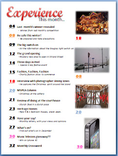
This is my final contents page. I decided to associate the pictures with the text which are the page number you would find the story about that image by colour. I think it brighteners up the page. I didn't want to over do it with the pictures so decided just to use four. I choose to drop the word contents as it is fairly obvious that it is a contents page. Also used the word experience from the masthead, i think it works really well.


No comments:
Post a Comment