Sunday, November 13, 2011

Research

For my A2 Coursework i have decided to do a local regional magazine.
I have a few ideas of what my regional magazine could consist of. One of my ideas is to be a informative magazine of the 'pretty' spots on the Isle of Man. The magazine would include pictures of the different areas, and could look into the history of that particular area. The magazine would be different every week. Another idea is to do a Christmas special about the island, informing people of what there is to do around the Christmas period. And my final idea was to create a regional magazine for teenagers, informing them what there is to do on the island. I have yet to decide which one to do.  

To begin the pre-production stages of my A2 coursework, I will be analyzing in depth other regional magazines. This will be beneficial; as looking at the layout/content/style will help when producing my magazine.
This is a regional magazine in surrey. I wanted to look at one from a different area because i am doing one for the Isle of Man. So for my research i didn't want too just look at ones for the island. I like the image on the front of this, it makes surrey look like a beautiful place. The genre of this seems to be informative about surrey, its got cover lines such as 'Where to find the best fish & chips' and 'Places we love' this seems to me the main cover article about nice places around surrey. For my regional magazine, i have a few ideas of having beautiful spots around the island or to have a Christmas special.


This is one of the free regional magazines for the Isle of Man which comes free with the local courier. I love the front cover of this, its what a street looks like today with a picture held up to what it looked like back in the day. This is clearly the main article which is featured inside. Also the title 'ManxTails' i think that is relevant and i like it. This free magazine is produced every month. This issue is November 2011. I also like how there isn't too much writing on the front of it, just simply 'Picture Perfect Liam Gilam captures local scenes then and now' that's all it needs is the main cover article. I think the creators of the magazine do this because they don't need other stuff on the front because they aren't trying to get people to buy it because it comes free with the paper.


This is the contents page for 'ManxTails'. Its quite plain and simple. Its contains a few images and an advertisement. There is section saying 'Regulars' which i think means that is the same every month but a different article. I'm not too sure if i like the lay out, it does work i just don't think I'll take the same approach. The type of articles that are included are things like whats happening around the island and things to do with wildlife and also other local things.


This is the article from the front cover. It does continue on to another page but its split by an advert. I like this article, because it is showing different places around the island; then & now. I think this is a good thing to include in a regional magazine as people will be interested in what certain places use to look like.


This is continued over the page. With more images and the rest of the article. I think something like this could be good to do in my magazine. Not then and now but something to do with the different landmarks.


This is the 'The Month Ahead' page, I think that i will include something like this because I'm leaning more towards doing a Christmas one. I will change it to whats on or something like that. I like how there is different subheadings so there is something for everyone.


For the next magazine i researched, it wasn't the genre i was looking for, but i wanted to look at how different it would be.


This is 'Gallery' this is more of an upper class regional magazine for the Isle of Man, It looks elegant and posh, however it is free which surprises me. It is also a magazine in Jersey for the same purpose. I don't really like how plain this is. It doesn't really have anything to do with the Isle of Man until you get inside. But someone looking at that on a shelf wouldn't know it was for the Isle of Man. The cover lines don't seem to be so much about the island.. 'Nascar' - ' Manx photographer in the USA', 'Gaming & Gadgets' etc. I think that this is okay, it doesn't need to be all full on about the Isle of Man.


This is the contents page. Its very formal looking. I quite like this style but in my magazine i want it to be more relaxed. It is split up into sections and colours which i like. 'Upfront', 'Events', 'Travel', 'Culture', 'Fashion & Beauty', 'Appetite', 'Business', 'Active', 'Hardware' and finally ' Paparazzi'. This seems to cover a wide range of things for different audiences. However, the magazine does seem like its aimed and one specific audience which is the more upper class.  


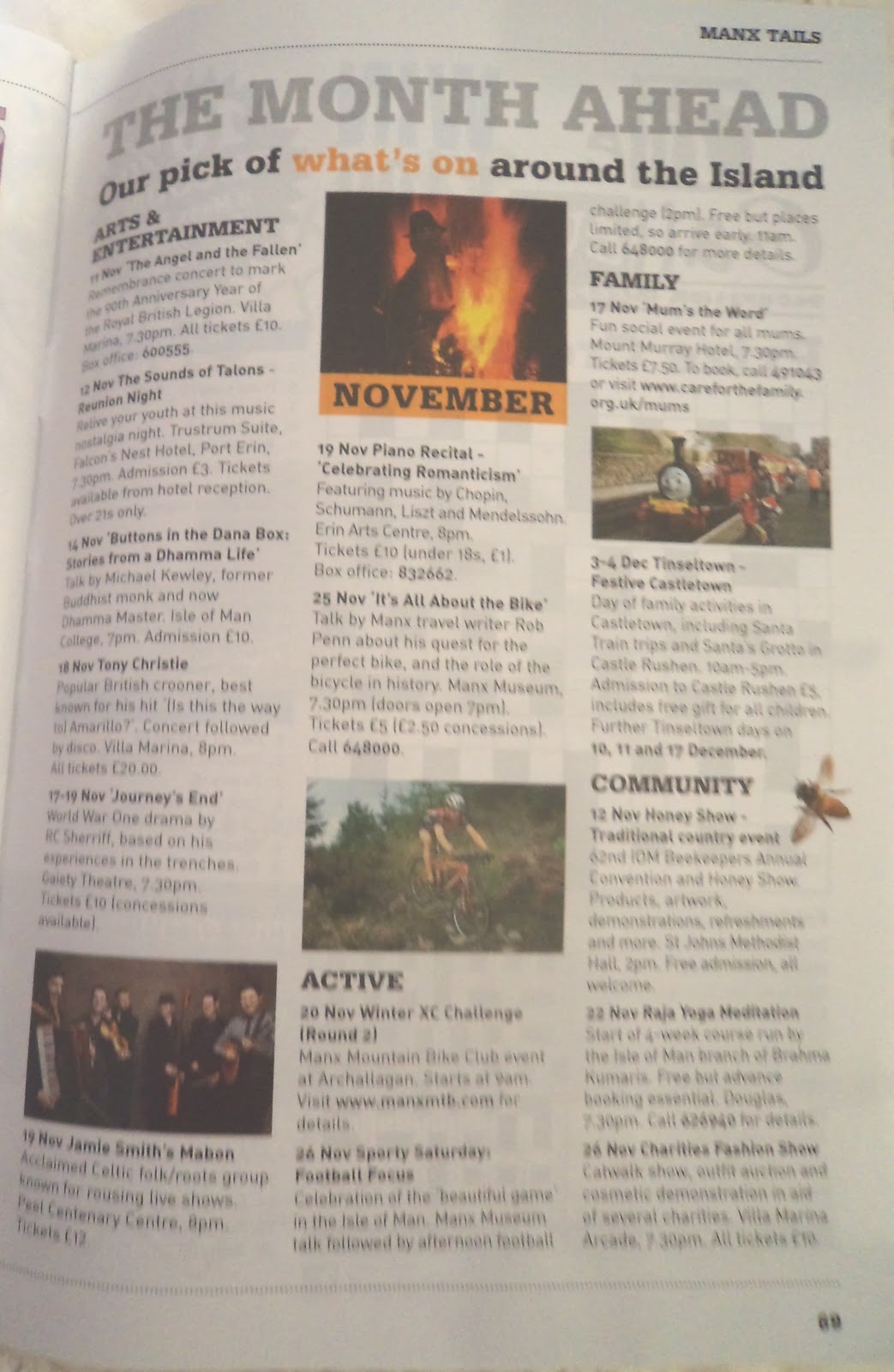
Finally i looked at a Christmas one which is from a local weekly newspaper. I really like this. I want mine to be similar. With a main image then just a little bit of text, just so the look isn't taken away from the main image.


This is the contents page from the Christmas magazine. I don't really like the layout of this. Also i wont be having an advert on mine. I will just concentrate on having whats inside and having a few images.


No comments:

Post a Comment